Create a layout
A layout dictates where and how offers are displayed on your page. The most common layout types are overlay and embedded.
Add a layout
- Log-on to my.rokt.com.
- Click Transactions.
- Click Layouts.
- Select Add layout.
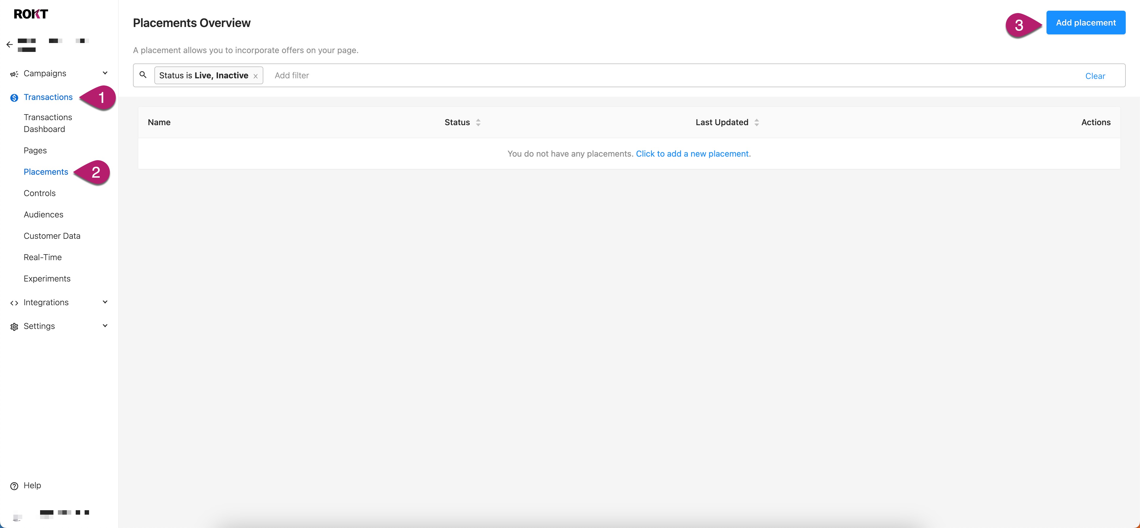
- Select a layout template.
Design your template
You can toggle between desktop and mobile views of your layout using the buttons at the top of your screen.
Provide a name for your layout.
Personalize your Theme:
Settings
Setting Description Offers Set the Minimum and Maximum number of offers to show on your layout. Frequency cap Set the period to suppress your layout for returning visitors. Language Select the language to disply your layout in. Platform Select the platform your layout will display on. General style
Setting Description Background Set the background color of your layout. Outer border Set the Weight, Radius, and Color for your outer border. Spacing Set the Margin and Padding for your layout in Pixels (px). Top divider Set the design parameters for the top divider.
A top divider will only show if your top margin is >0.Bottom divider Set the design parameters for the bottom divider
A bottom divider will only show if your bottom margin is >0.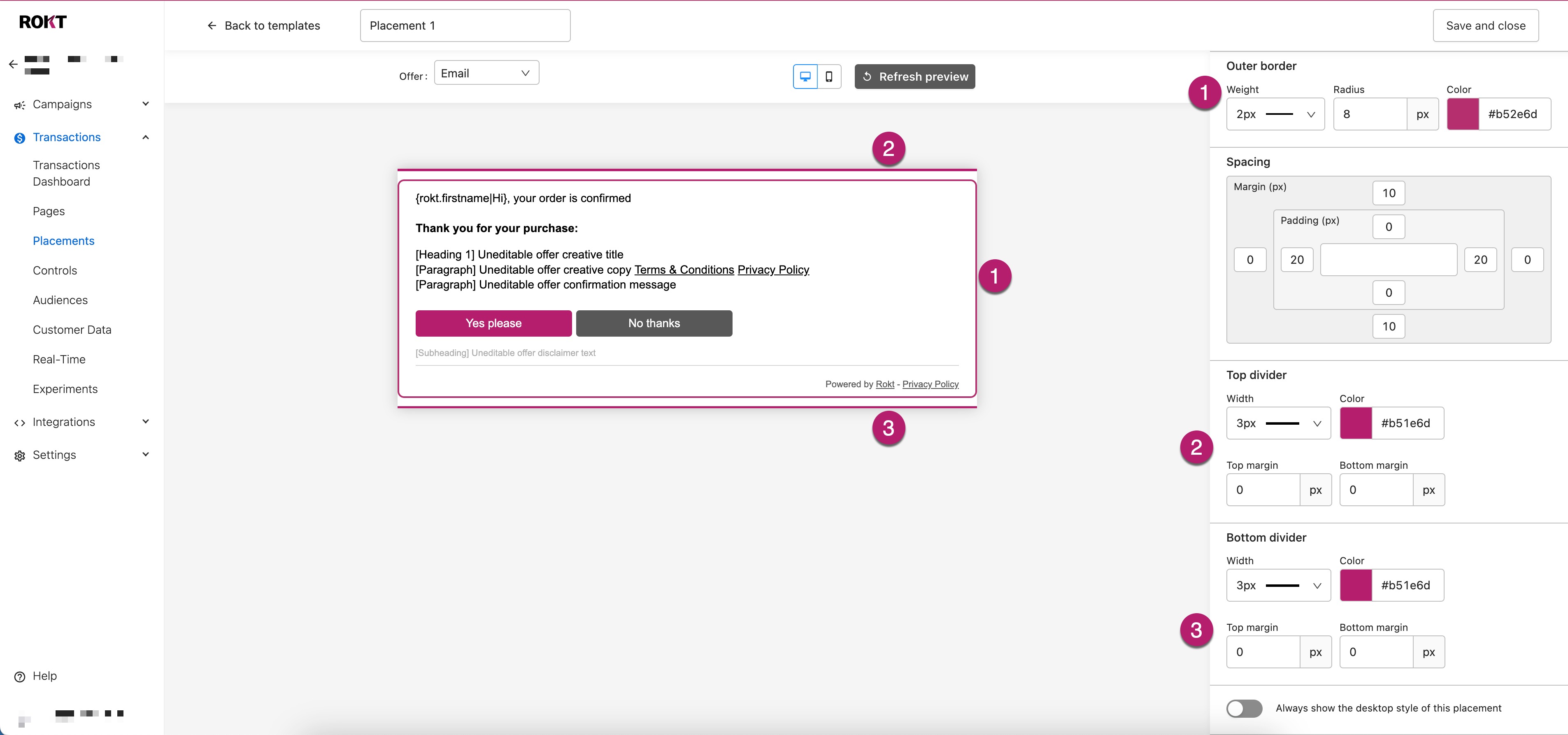
Progress tracker
Setting Description Show progress tracker Toggle On or Off. Progress tracker look Seclect between Numbered, Filled Circles, or Dashes to display progress through your layout. Start from Select where to start showing the progress tracker, either on the first or second ad. Start numbered counter at This directly relates to the Start from setting. If you have opted to start numbering from the first ad, you should select 1 here, if you have opted to start numbering on the second, select 2. Location Select the location where your progress tracker will be displayed on your palcement, either Above or Below. Visited Set the colours to show which ads have been visited in the progress tracker. Unseen Set the colors to show which ads are yet to be visited in the progress tracker. 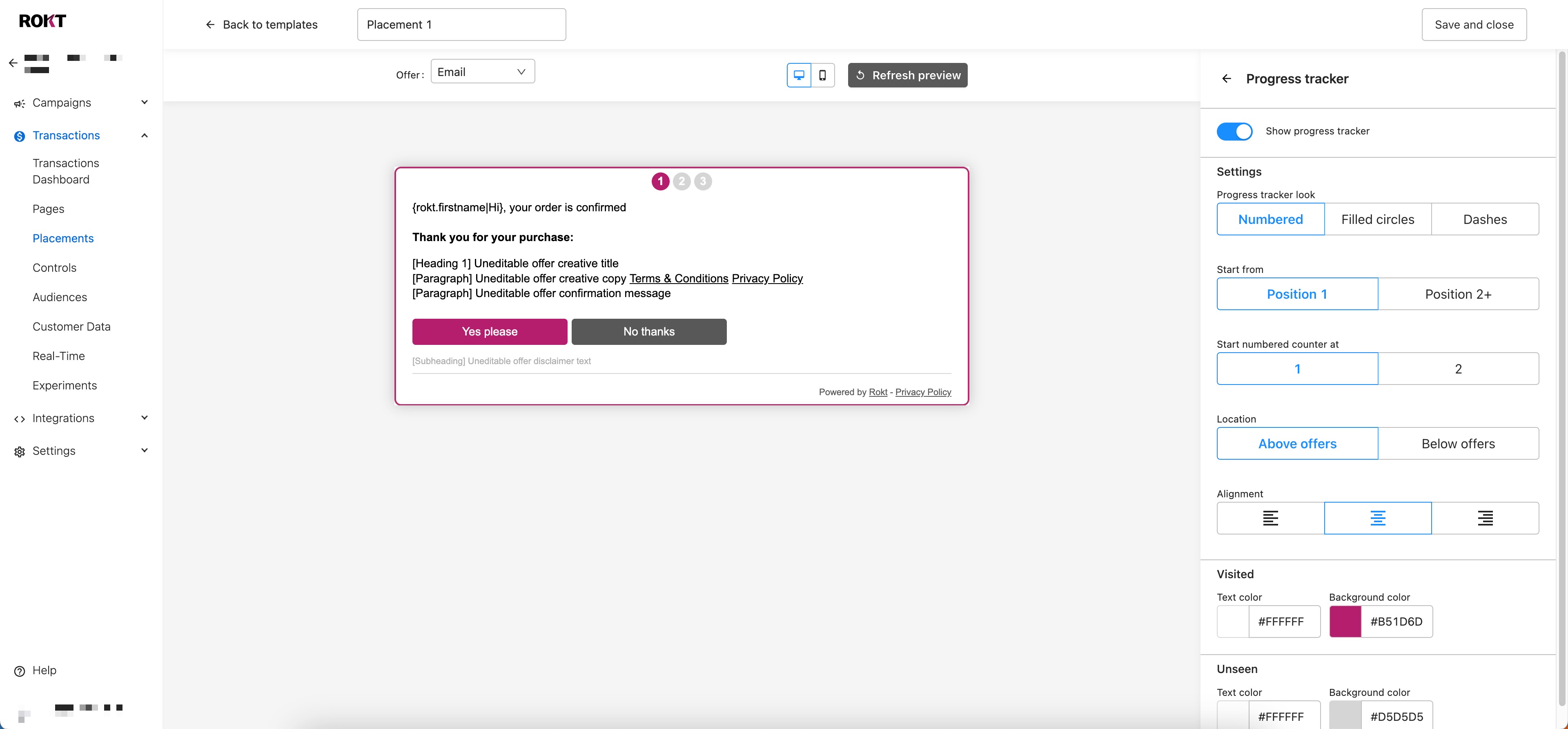
Text styles
Choose a font to use in your layout from the drop-down.
We have a small choice of fonts available initially, however, you can upload your own brand fonts as follows.
Add a custom font
noteYou must download your font file (.tff, .otf, .woff. or .woff2) before starting this process.
You can add fonts to your layout by following these steps:
- Click Manage custom fonts.
- Click Click to add a new font.
- Select the platform your font will be used on (multi-select).
- Click Upload, search for your file and select it.
- (Optional) Click Show opitonal styles and upload a Bold or Italic version of your font.
- Click Save.
Your new font will now be avaialble to select from the drop-down.
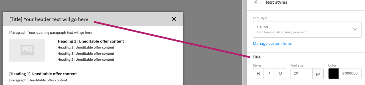
You can edit text properties such as font size, color, and markdown styling (with bold, italic or underline options) for each text section in your layout. To understand which text section you are editing, check the name displayed both on the layout and within the editor. In this example, the Title section of the layout is being edited:
Buttons
Setting Description General Fonts Select the font and font size that you want to use on your buttons. Button radius This determines how rounded the edge of the button is. 0 px will provide square edges and 16 px will provide the most rounded. Button size Set the minimum height and width for the buttons. CTA letter case Select between As typed which will display as you have typed the text, Title case which will display the first letter of every word as uppercase, or Uppercase whihc will display all letters in uppercase. Formation Select whether you want to display the positive or negative response first. Mobile view Select whether you want to display your buttons Stacked or Unstacked on mobile devices. Primary and Secondary Use these to personalize the styles and colors of your buttons. Hyperlinks
Setting Description Footer Desktop default Sets the default style and color of your hyperlinks in the footer of your layout when it appears on a desktop. Desktop hover Sets the hover style and color of your hyperlinks in the footer of your layout when it appears on a desktop. Mobile default Sets the style and color of your hyperlinks in the footer of your layout when it appears on a mobile device. General Default Sets the default style of your hyperlinks in the body of your layout. Hover Sets the hover style of your hyperlinks in the body of your layout. End of offers behaviour
Setting Description Content Title Set the title of the final page of your layout i.e., after all offers have been presented. Message Add a message that will be seen on the final page of your layout. Style Text alignment Set the alignment for the text on the final page of your layout.
Personalize your Sections.
Header
Setting Description Content Text Add the text that will appear in the header section of your layout.
**This text will render as black (#000000) on your layout.Style Background Set the background color of your header. Borders (Optional) Set the Weight, Radius, and Color of borders for your header. Header spacing Set the Margin and Padding for your header in Pixels (px). Text alignment Set the alignment for the text in your header. Section divider Shows a horizontal line underneath the header when toggled on. 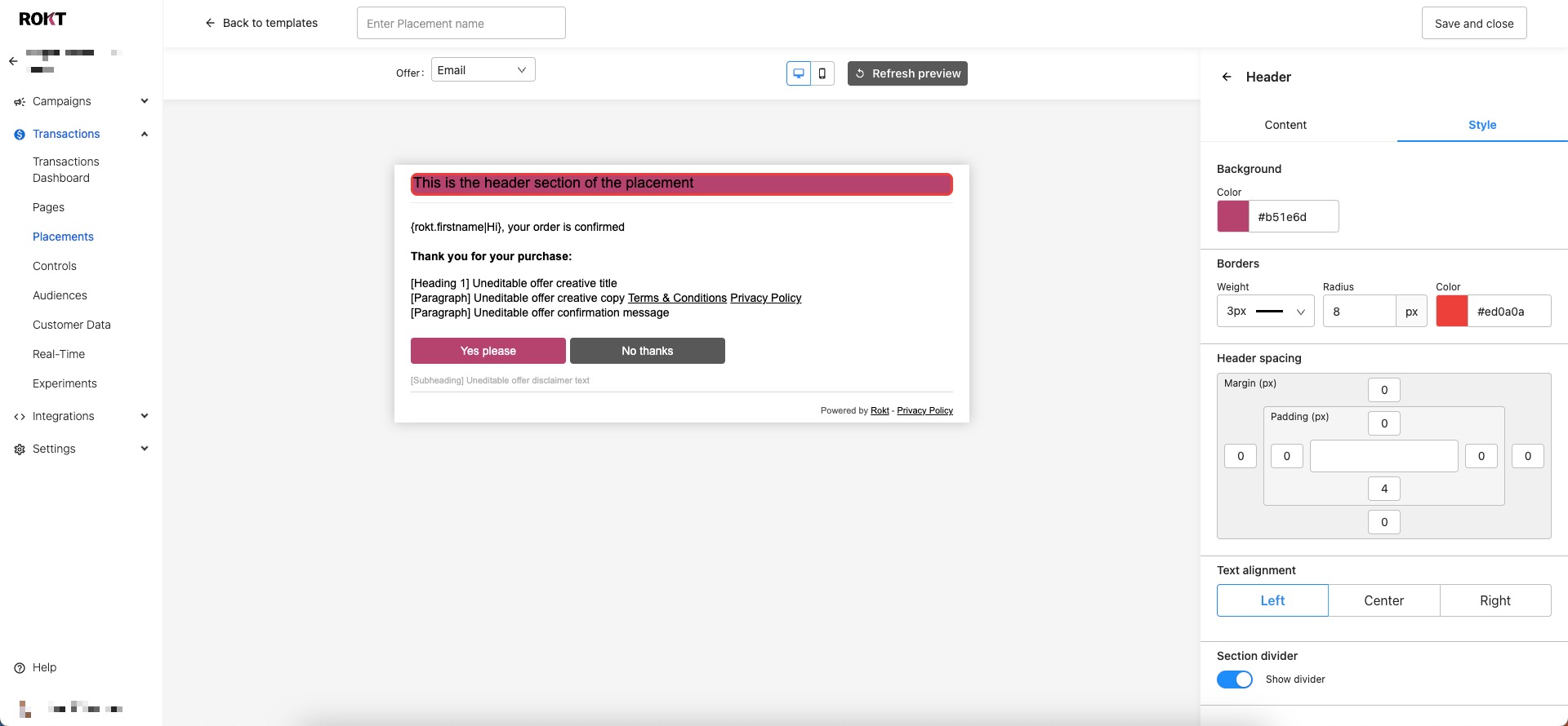
Opening paragraph
Setting Description Content First paragraph This is pre-populated with text, but can be edited. Second paragraph (Optional) Space for you to add further text if needed. Style Background Set the background color of your opening paragraph. Borders (Optional) Set the Weight, Radius, and Color of borders for your opening paragraph. Opening paragraph spacing Set the Margin and Padding for your opening paragraph in Pixels (px). Text alignment Set the alignment for the text in your opening paragraph. Offers
Setting Description Style Background Set the background color of your offers. Borders (Optional) Set the Weight, Radius, and Color of borders for your offers. Offers spacing Set the Margin and Padding for your offers in Pixels (px). Settings Images Decide when and where to display images on your layout. Alignment Select the alignment of your content. Creative copy positioning Select where you want the creative copy to appear. Buttons Select your button alignment. Close on negative response If this toggle is selected, your layout will close if there is a negative response to any creative. Response types Choose the type of response that will appear. Confirmation message
Setting Description Show confirmation message Select whether to display the confirmation message on all positions, only from position two on, or not at all. Closing paragraph
Setting Description Content Text (Optional) Enter text for a closing paragraph which will appear below the buttons on your layout.
There are two text boxes, one for Position 1 and one for Position 2+. If you want the text to appear on all positions, you must complete both text boxes.Style Background Set the background color of your closing paragraph. Borders (Optional) Set the Weight, Radius, and Color of borders for your closing paragraph. Closing paragraph spacing Set the Margin and Padding for your opening paragraph in Pixels (px). Text alignment Set the alignment for the text in your closing paragraph. Section divider Shows a horizontal line underneath the closing paragraph when toggled on . Set the style for the divider if needed. Footer
Setting Description Settings Links Select which links to show in your footer. Link display text Enter the text to display if you have activated Show client privacy policy. URL Enter the URL to your privacy policy if you have activated Show client privacy policy. Style Background Set the background color of your footer. Borders (Optional) Set the Weight, Radius, and Color of borders for your footer. Closing paragraph spacing Set the Margin and Padding for your footer in Pixels (px). Text alignment Set the alignment for the text in your footer. Links in mobile view Select whether to stack the links in a mobile view or display them in line.
Click Save and close to send your layout to Rokt for approval.